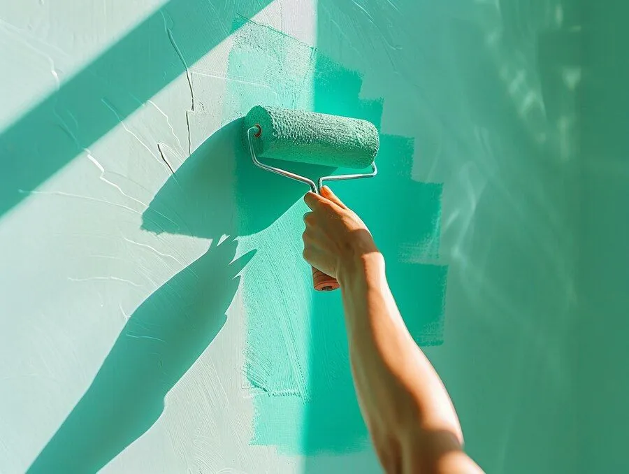
Choosing the perfect paint color can be paralyzing. In the past, my home had Pepto pink living room walls, rainbow sherbet colored kitchen, and cantaloupe master bedroom. All as a result of poor paint color choices. Currently, I have spent three years selecting a color for my living room and dining room. I think I am going with Spring green. In a world where thousands of colors can be yours for just $25 a gallon, it pays to consider that the thousands of paint chips boil down to seven main colors.
How to choose a paint color
The seven colors include red, orange, yellow, green, blue, indigo, and violet. The easiest way to select aa color is to decide if you will go monochromatic or complementary. Monochromatic rooms are calming with one color in different tones. Your beige room with whicker furniture, baskets, and candles is an example. Complementary rooms are energetic and stimulating. Like spring green walls surrounding knotty pine focal wall with copper and red plush chairs.
Find three sample paint strips with the desired main color, and you instantly have 15 to 18 colors you can use, since each sample strip typically contains six paint colors. Look at the darkest color at the bottom of the strip. If you can live with the one at the bottom, you know you’ll like the middle and top, but if you choose by looking at the top, lightest colors, all the cards in that category start to look the same.
The next step is to choose one of the three paint colors as your wall color and to save the other two to be used around the room in fabric or furnishings. Finally, choose a fourth color that can be used as an accent: Splash a little of that color into every room of the house—by way of a pillow or plate or artwork. It makes a connection between spaces.
Finish to Create an Appealing Visual Effect
Once you have your colors in hand, consider the finish you’ll be using. Though today’s flat paints have increased stain resistance, conventional wisdom has long held that satin, also called eggshell finish, is best for walls because it is scrubbable and doesn’t draw attention to imperfections. Semi-gloss and high-gloss finishes, it was thought, were best left to the trim, where they could accent the curves of a molding profile or the panels of a door.
Today, however, finishes are also being used to create visual effects on the entire wall. Paint one wall in a flat or satin finish and the adjacent wall in a semi-gloss, both in the same color, when the light hits the walls, it creates a corduroy or velvet effect. Similarly, you can paint the walls flat and the ceiling semi-gloss to achieve a matte and sheen contrast. The ceiling will feel higher the more light-reflective. Keep in mind that the higher the gloss, the more sheen and the more attention you draw to the surface. Used strategically, color and gloss together can emphasize your interior’s best assets.
The Feeling You Want In The Room
Colors evoke an emotional response. In general, cool colors (blues, greens, and clean whites) are perceived as restful and soothing while warm colors (like red, orange, and yellow) create a sense of drama and energy. Cool colors are calming in private rooms—like the ice blue that covers the walls in this bath; warm colors are a good way to enliven social spaces. The psychology of color is a minor obsession among paint professionals. Many say you should choose a color based at least in part on how a room is used and the mood you want to establish.
Painting social rooms (dining rooms, kitchens, family and living areas) warm colors like daffodil-yellow, coral, or cranberry, and give private rooms (home offices, powder rooms, bedrooms) cooler hues like sage-green, violet, or sky-blue. Keep in mind, when it comes to emotional effect, of course, one person’s welcome-home orange will be another person’s signal to scram.
Red will increase your appetite—and your blood pressure; blues and greens are nature like and calming; purple is loved by children but not necessarily by adults; yellow is inviting; and orange can be welcoming but also a little irritating, depending on the tint, tone, or shade.
Research done by Behr indicates that yellow can stimulate the brain, so it might be worth considering rooms where homework is done; but avoid yellow in bedrooms, where the goal is generally to chill out. Instead, explore these calming colors in the bedroom to help you sleep better.
Know Your Whites
Whites come in a staggering variety. Pure, clean whites are formulated without tinted undertones. These are favored by designers looking to showcase artwork or furnishings and are often used on ceilings to create a neutral field overhead.
Most other whites are either warm—with yellow, rust, pink, or brownish undertones—or cool, with green, blue, or gray undertones. Use warmer whites in rooms without a lot of natural light, or to make larger spaces seem cozier. Cool whites, by contrast, can help open up a space. Test several at once to see which one works best with the other colors at play in the room. Lastly, the lightest end of the paint chip sample is often the whitest color and is always the best white to use to blend with the wall colo
Conclusion
Productive painting offers professional power washing and residential, commercial, and industrial interior and exterior painting services to the communities of Wall, NJ and throughout Monmouth County, NJ. Fully licensed and insured, Productive Painting Company is owner operated NJ LICENSE #13VH04439800. Hours of operation Mon to Fri 8 AM to 5 PM and Saturday 8 AM to 1 PM. Closed Sundays.
Productive Painting Call Now: (732) 458-2438